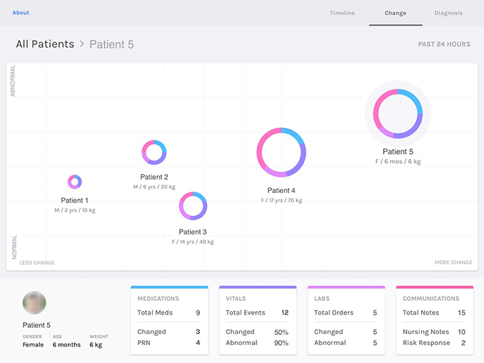
Visualization to Support Patient Prioritization
 This project aims to make it easier for doctors to determine the order in which to see hospitalized patients. Currently, to prioritize patients, physicians generally need to read through a several-page chart for each patient. Then they look at many factors like whether a patient’s condition is changing and recent test results.
Dr. Pollack’s team is building software that aims to make this process easier. This tool creates a color-coded circle for each patient and puts all current patients in one grid. For example, if a patient’s circle is in the upper right, that patient is likely more critical, while patients in the lower left are more stable. Doctors can also click each patient’s circle to zero in on specific test results and other aspects of their health. This quickly sorts relevant information, enabling them to understand each patient’s status in just a few clicks.